20 Years, 30 Stakeholders, 1,000s of Webpages, 1 Website.

We redesigned the University of California, Berkeley’s Department of Electrical Engineering and Computer Science (EECS) website from thousands of pages on disparate systems to one responsive, easily navigable marketing and information experience.

The Challenge

Berkeley’s EECS department offers top-ranked programs that attract stellar students and professors from around the world, creating the frontiers of computer science and technology. But they’d been so busy building these frontiers that while they’d added to their site, they hadn’t updated its technology or organization for a long time, and the visual design was from 2006. The result: an unnavigable labyrinth of static pages tied together by legacy technologies.

The department needed a site, built in Drupal, that would entice a diverse pool of top applicants, act as a resource for internal audiences, and reflect the department’s diversity, rigor and prestige. They also needed a site that would satisfy all of their 18 internal stakeholders—administrators, faculty and staff—who drove divergent agendas throughout the project. And, one more thing: it had to meet strict accessibility standards.

Paring Down a Behemoth

We knew we needed to cut out much of the site’s content and consolidate the rest, so we undertook a discovery phase to see what could go and what could stay. This research helped us understand what users and stakeholders needed from the site, how we could improve its underlying technologies, and how changes would affect content management.
Working with Kalamuna to figure out how people were using the site, and how they wanted to use it was eye-opening and crucial to determining how we should structure its new iteration.
Jan Pardoe, Manager, Administrative Computing Group
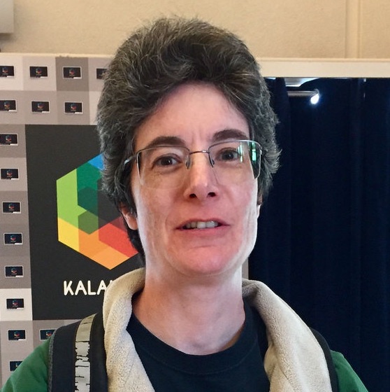
A portrait of Jan Pardoe, Manager, Admininstrative Computing Group.

Who needs what?

Interviews, survey responses, and Google Analytics told us that while the new site should primarily speak to potential graduate students, it had other audiences too, each with their own needs. To keep these users in mind throughout design, we abstracted them into personas, fictional characters representing their backgrounds and needs.

Who are we competing against?

In order to market the department to potential applicants, corporate partners, faculty and staff, the site would communicate the department’s unique selling points. Our competitive analysis looked at other top-tier EE and CS department sites to understand how they expressed their positions in “the market” through messaging, interactivity and visual design.

What’s keeping this thing together?

Our technical analysis revealed a patchwork of disparate systems and legacy technologies brought together via a reverse proxy. We prototyped complex single sign-on requirements early, and we experimented to identify solutions and workarounds that strengthened project goals, and focused on users’ needs.

Reimagining the UC Berkeley EECS Site

After delving into communications, technical and user experience research, we shared our findings with our EECS stakeholders. Together, we ideated, sketched and discussed iterations of what would become the new site.

Creating Structure and Content

Our massive content map visualized the relationships between all content, new and old, and helped us begin to imagine what a more nuanced site map might look like. It also helped us realize new relationships between sections and create a new menu structure with new titles.

Collaborating with Stakeholders

Although its electrical engineering and computer science departments shared resources and curricula, the department’s “EE” and “CS” factions needed their own spaces on the site. Our collaborative sketching sessions helped us create separate EE and CS landing pages that funneled users into program-specific content.

Validating Information Architecture

How could we know if our imagined architecture and nomenclature was going to be clear to people? To find out, we performed card sorting tests, which ask users to organize information into categories. With so much previously disorganized content and strong multi-stakeholder opinions, insights from card sorting helped our team make crucial decisions.

Designing the Look

We iterated upon long-established UC Berkeley branding guidelines to create a color system and modular visual components that would lend the EECS department a unique look-and-feel. This was an unusual challenge because we were designing for three homepages: the main homepage, the electrical engineering division landing page, and the computer science division landing page—all while satisfying those divisions’ different stakeholders. We created a living styleguide documenting the site’s building blocks in code.

The Tech that Tied it All Together

Modernizing the EECS site posed several technical challenges. To support a long-term content migration strategy well beyond the main site’s launch date, we created a flexible, responsive design system of templates and widgets built upon the Panopoly Drupal distribution to support emerging content needs in on-brand expressions. The work required a complex and incremental multi-platform redirect strategy to address massive shifts in systems and content architectures. We also put in place multi-domain search, editorial workflows and content change notifications.

Unifying the Header + Footer Across Systems

The EECS website provides a unified appearance and consistent navigation across multiple backend systems, some in Drupal, some in other platforms. We created a custom module that returns only the rendered header or footer code so their legacy systems can include styles, scripts, and always up-to-date navigation maintained in the new CMS.

Integrating the UC Berkeley Events System

The new site keeps visitors up-to-date on related campus-wide events by automatically ingesting only relevant events from events.berekeley.edu for curation by department staff.

1 Website, 14 months, 100s of pages less.

The UC Berkeley EECS department now boasts an accessible website worthy of its legacy. With redundant content eliminated and new content made more efficient, users can now find information faster, on more devices, and get a more accurate impression of the department. And the numbers prove it:
kalamuna-logo-gem