
Modular Type Scaling for Frontend Developers
Share
Typography plays a crucial role in web development, influencing the visual appeal and user experience of sites and other digital interfaces. Here, I offer an overview of modular scale in web typography and how it can elevate the design and functionality of your project. Then I follow up with a basic code example to show you how to implement a modular type scale. This article is a quick primer for UI designers and frontend web developers, but anyone looking to enhance their understanding of typographic systems in web development will likely find it useful.
What is typographic scaling?
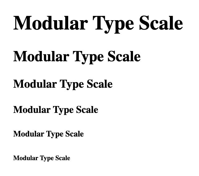
A typographic scale is a valuable tool for selecting font sizes, acting as a guide that can ensure visually appealing and well-organized text. Similar to music, where certain notes harmonize, a typographic scale focuses on using a limited range of font sizes that complement each other. When designing a layout such as a blog post or website, it's important to display appropriate font sizes for different elements like titles, subheadings, and paragraphs to present a balanced and well-organized composition. Following a typographic scale provides a clear roadmap, especially for beginners, eliminating guesswork and helping achieve a polished look without extensive typography knowledge.
The benefits of using a modular type scale
When it comes to web design, typography holds immense significance, and adopting a modular type scale brings a host of advantages; you might notice them in the relative type sizes of this very blog post.
Visual hierarchy and readability
By establishing a consistent ratio-based system for type sizes, you can achieve a harmonious visual hierarchy. This not only enhances the way compositions look, but also improves readability by allowing viewers to quickly understand the flow of information and thus navigate content. Notice how the smaller relative size of this paragraph’s subheader indicates its relationship to the preceding paragraph? That’s the relative type sizes creating visual hierarchy.
Adaptability across devices
With a modular scale, your typography seamlessly adapts to different screen sizes and devices while maintaining relative size ratios. This adaptability ensures optimal legibility and aesthetic appeal across various platforms, from desktops to mobile devices. Try opening this post on a large monitor and your mobile device at the same time and you’ll see this adaptability in action.
Consistent decision-making
A modular type scale saves time and effort by providing a reusable framework for making consistent typographic decisions in web development. You can maintain coherence and avoid inconsistencies by following the established scale.
Implementing a modular scale in web development
By now I hope you’ve got a general feel for what a modular typographic scale is and why it can be useful. Now, I’ll delve into an example code implementation and then pick it apart:
$base-font-size: 1rem; // 1rem = 16px
$font-scale: 1.25; // Major Third
$font-scale-mobile: 1.125; // Major Second

// Function to calculate power
@function pow($exponent) {
  $value: 1;

  @if $exponent > 0 {
    @for $i from 1 through $exponent {
      $value: $value * $font-scale;
    }
  }

  @return $value;
}

@function m-pow($exponent) {
  $value: 1;

  @if $exponent > 0 {
    @for $i from 1 through $exponent {
      $value: $value * $font-scale-mobile;
    }
  }

  @return $value;
}

h6 {
  font-size: $base-font-size; // 16px
}

h5 {
  font-size: clamp($base-font-size * m-pow(1), 1vw, $base-font-size * pow(1));
}

h4 {
  font-size: clamp($base-font-size * m-pow(2), 2vw, $base-font-size * pow(2));
}

h3 {
  font-size: clamp($base-font-size * m-pow(3), 3vw, $base-font-size * pow(3));
}

h2 {
  font-size: clamp($base-font-size * m-pow(4), 4vw, $base-font-size * pow(4));
}

h1 {
  font-size: clamp($base-font-size * m-pow(5), 5vw, $base-font-size * pow(5));
}
The clamp() function in the provided code snippet serves two important purposes: ensuring responsiveness and setting boundaries for font sizes.
By utilizing the clamp() function, you can define a range within which the font size should be constrained based on the minimal, in-between, and max value. This enables a seamless transition from desktop to mobile, ensuring optimal readability and aesthetics across devices.
Check out more on clamp() here.
Additionally, the pow() function is a powerful tool that allows you to easily apply multipliers to each heading level. It helps maintain the desired proportion and hierarchy within your typographic system.
When setting the $font-scale value, it's crucial to consider the specific needs and usage of your website. Here are some recommended ranges to guide you:
Small scales (less than 1.2)
These scales offer subtle variations and work well for both mobile and desktop apps or the mobile version of a responsive site. They provide a balanced and cohesive typography experience.
Medium scales (1.15–1.333)
This range establishes clear hierarchies and assists in organizing sections with subheadings. It is versatile and suitable for various desktop sites, including blogs and marketing sites. Medium scales strike a balance between impact and readability.
Large scales (1.333 or greater)
Implementing large scales effectively can be more challenging, but they can create a bold visual impact. They work well for portfolios, agencies, certain marketing sites, or avant-garde works. Use large scales carefully to ensure legibility and avoid overwhelming the user.
By considering these recommendations, you can fine-tune the $font-scale value to achieve the desired typographic hierarchy and aesthetic for your web project.
For further assistance in visualizing and selecting your desired scale value, I recommend visiting typescale.com.
That’s it. You just got the basics of modular type scaling. I hope I’ve provided a foundational understanding of the topic and that you feel empowered to begin creating visually stunning and user-friendly websites that leave a lasting impact.

Jon Zhang
Our lead front-end developer, Jon, has been making the internet more beautiful since before The Force awakened. He brings designs to life with a humble expertise that makes collaboration a joy. He also makes delicious food. We hear his kabobs are particularly legendary, and wouldn't mind (hint hint) if we had some at our next retreat.